Cafe Fitzgerald
Case Study
Student Project
Challenge: To create branding material for a cafe based on the work or life of an important figure. The project required the creation of a logo and branding guide.
Solution: The cafe is based around the works of F. Scott Fitzgerald and the 1920s jazz age he is often associated with writing about.
Logo
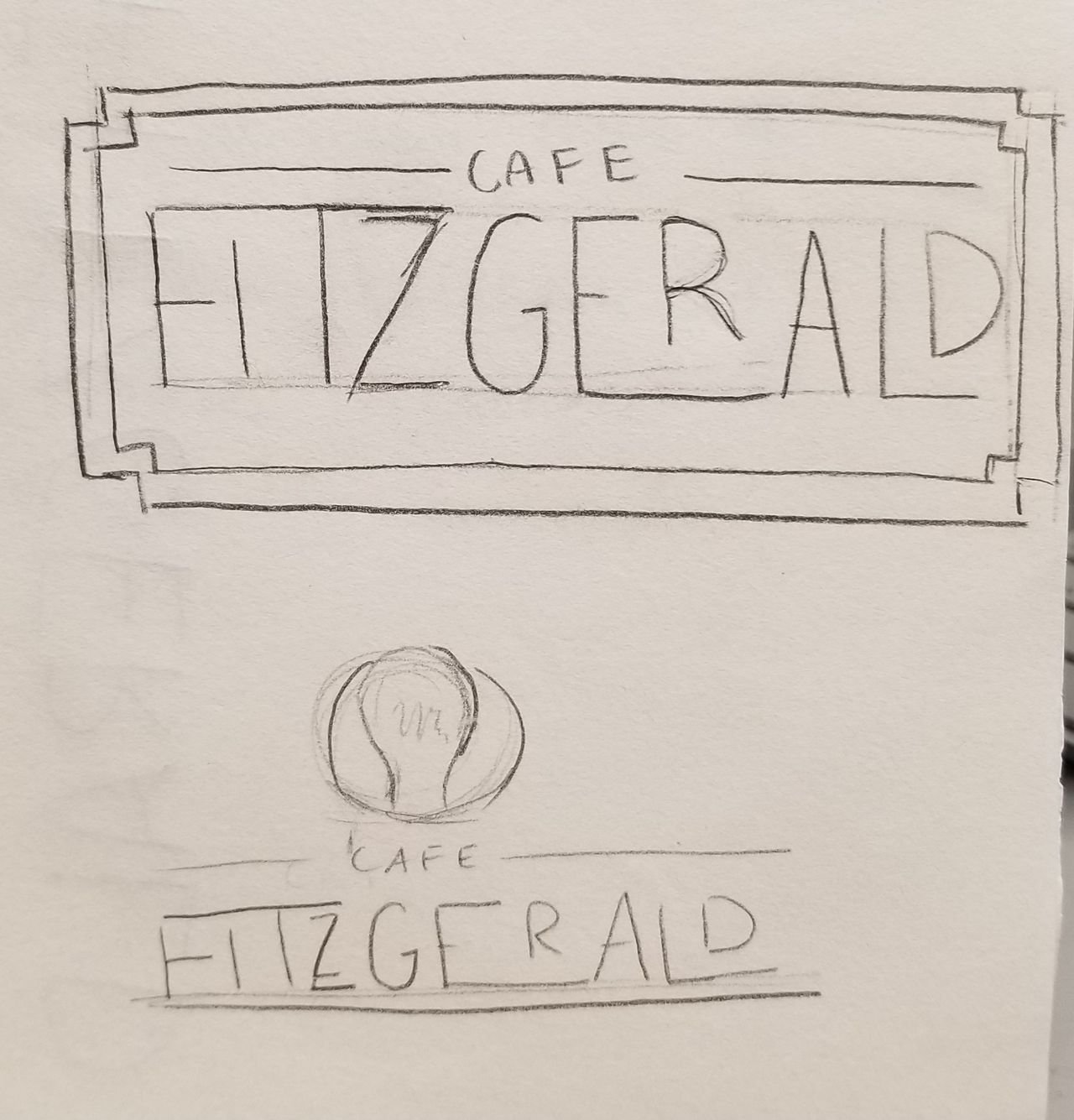
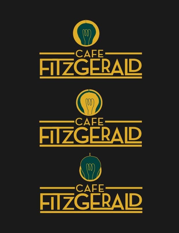
The branding guide began with the logo. There were a few logo designs, most of them were based on patterns from the art deco period of design. The final logo design was inspired by the “green light” in Fitzgerald’s novel The Great Gatsby. The gold and green used in the logo became the base color palette for the rest of the cafe collateral.
Slogan and Color Palette
The slogan was inspired by the 1920s period that Fitzgerald wrote about in his works.
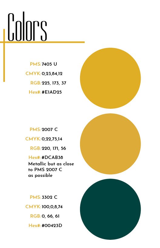
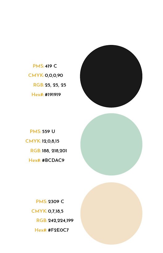
The color palette was inspired by the elegance of the art deco period. The colors are centered around black and gold with and emerald green accent. The emerald green was chosen to contrast the brightness of the gold and reference the “green light".
Fonts
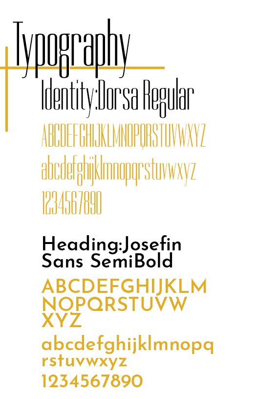
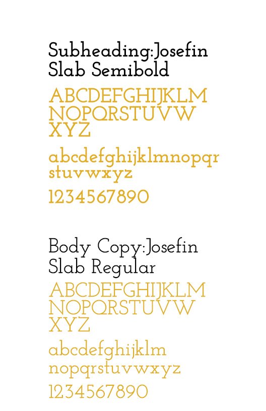
The fonts chosen for this brand were Dorsa, Josefin Sans, and Josefin Slab. Dorsa was chosen as an accent font that is used for some headings because of its condensed look. The Josefin Sans and Josefin Slab fonts were used because they were fit with the sharp art deco patterns used throughout the collateral.
Business System
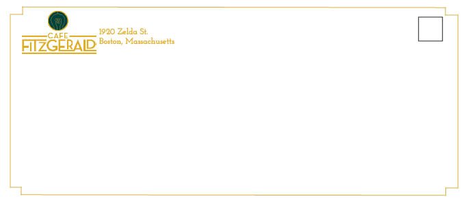
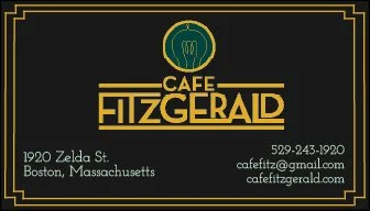
The business system includes letterhead, a business card, and and envelope.

Menu
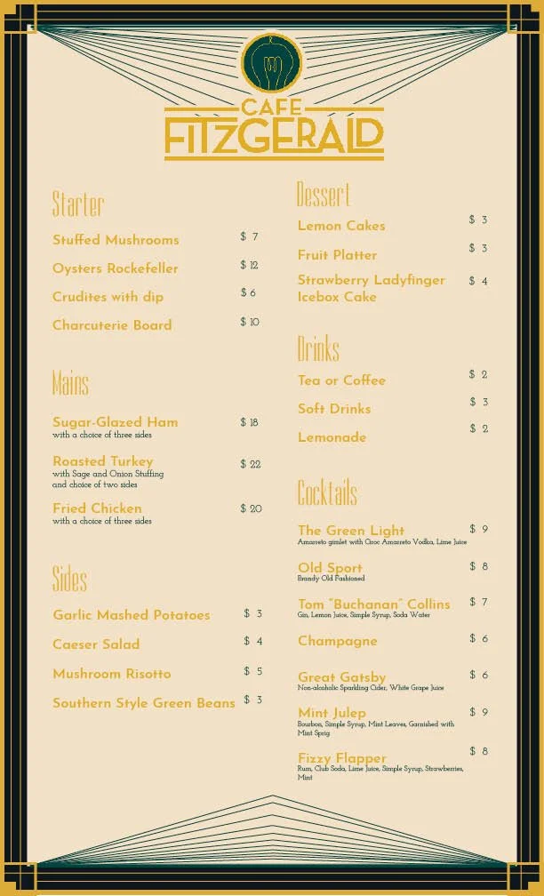
The menu design uses patterns from the art deco period with very little text to create a more elegant design that would come from this time period.
Advertisements
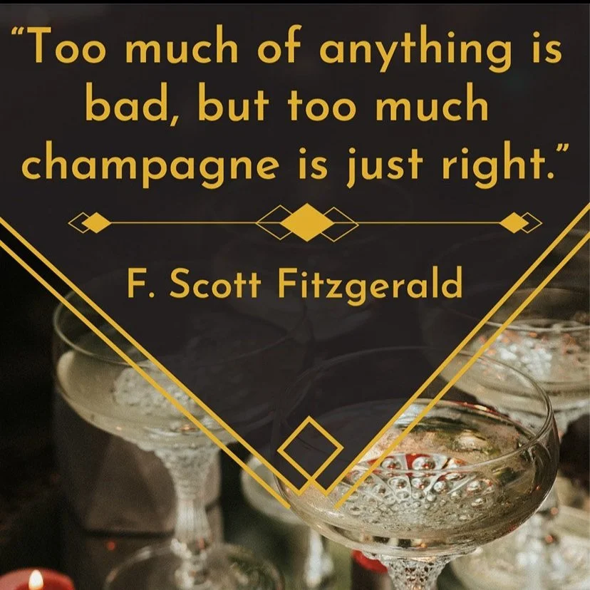
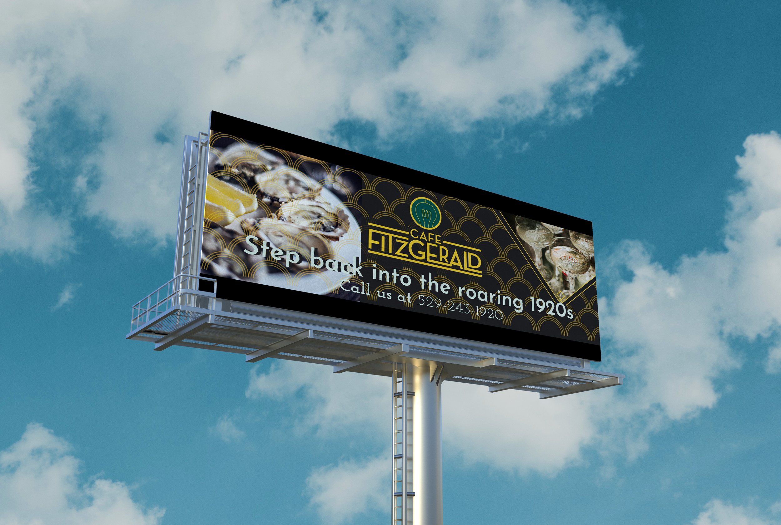
The advertisements are meant to draw people to the cafe while also using some quotes of Fitzgeralds to show his impact on the literary world.


Collateral
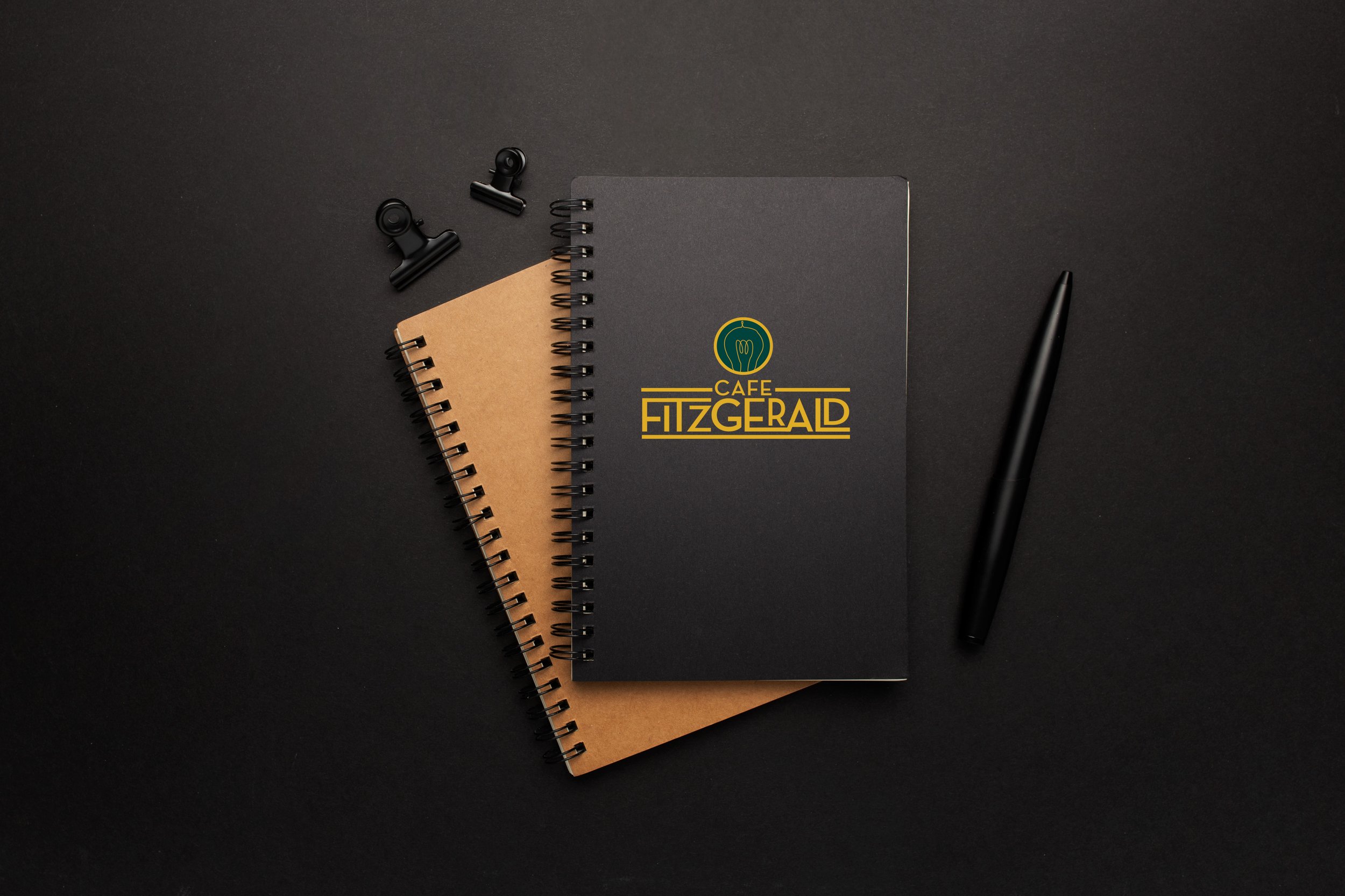
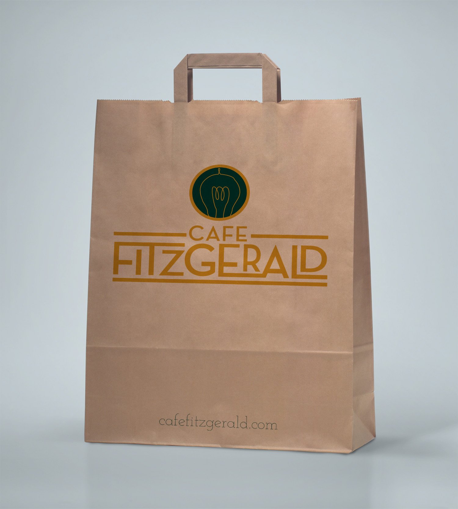
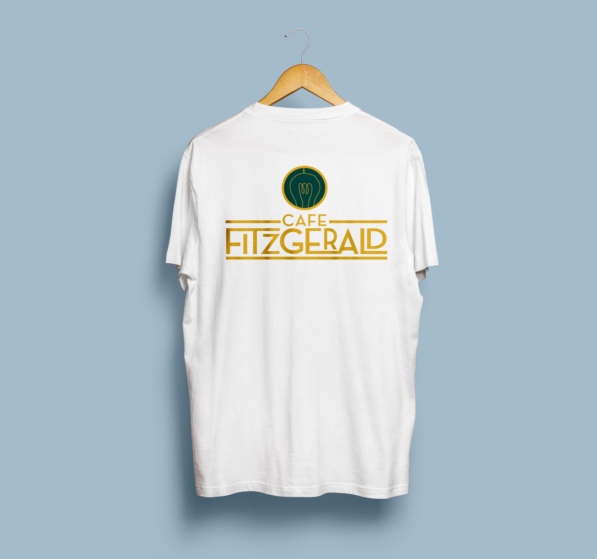
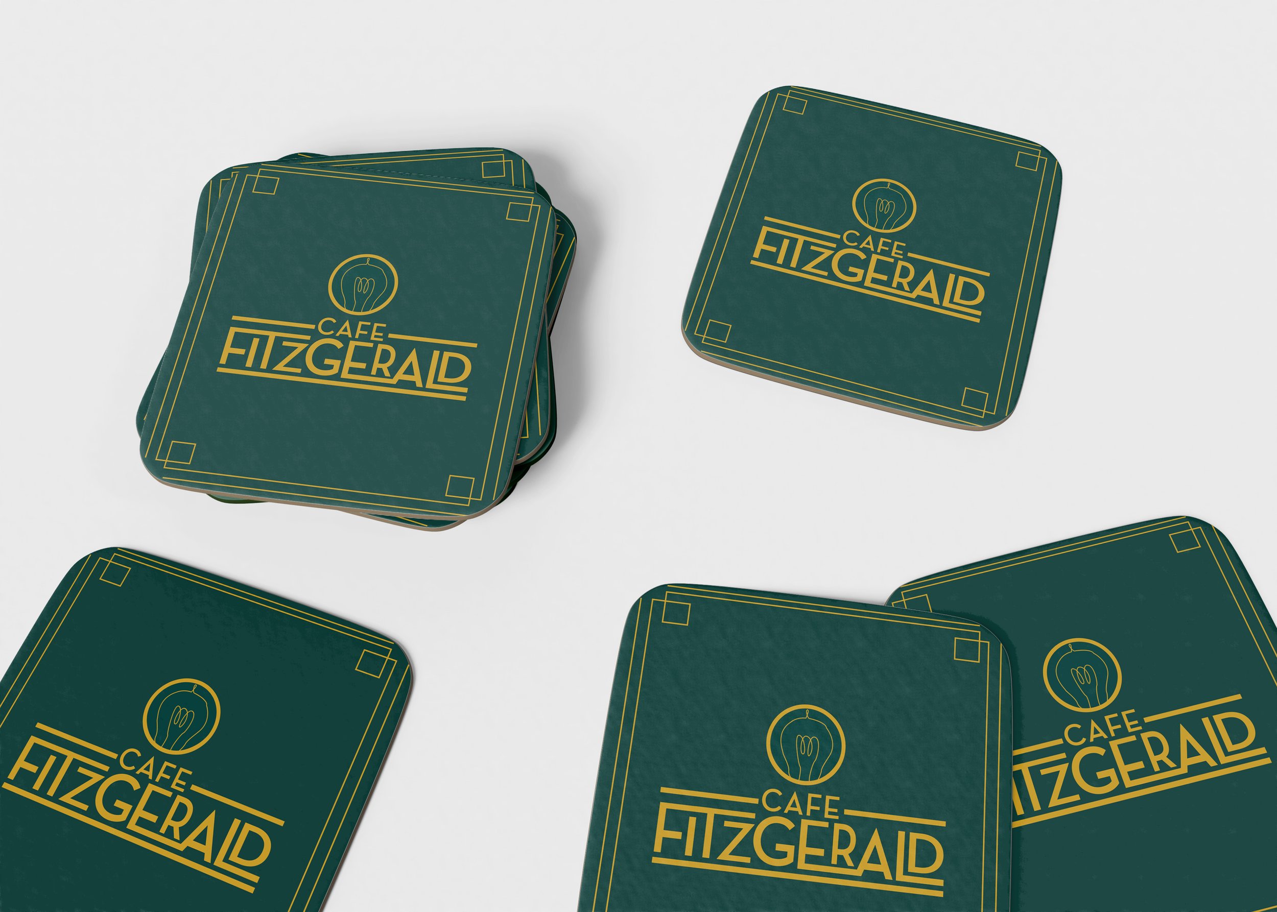
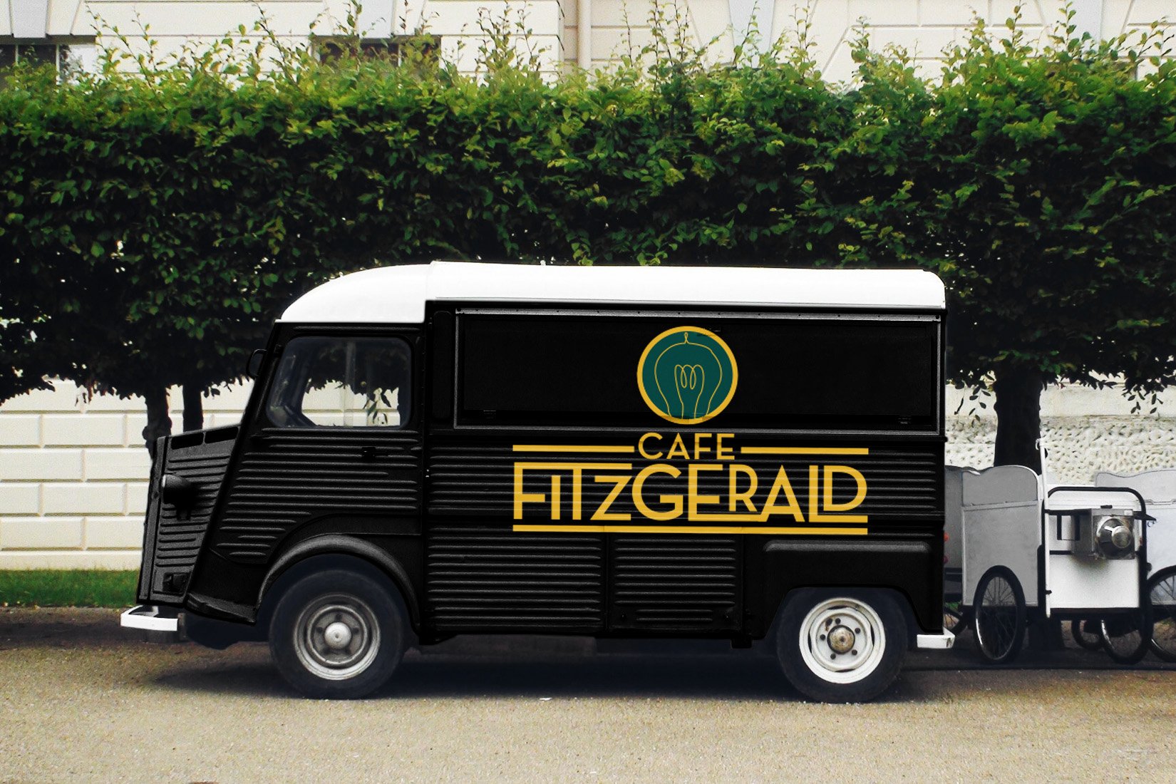
There is a range of collateral from memo pads and pens to signage and delivery vans.
