Angel’s Attic
Logo Redesign
Freelance
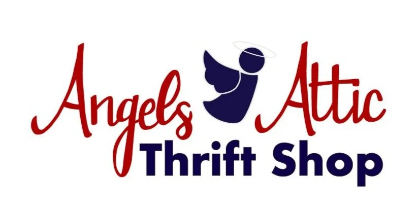
Challenge: This non-profit wanted a more modern logo to mark their 20th anniversary. The client wanted the updated logo to utilize a similar color palette and a handwritten type face.
Solution: The updated logo uses a combination of a red hand written typeface combined with a dark blue sans serif font to create hierarchy in the logo. Along with updating the typefaces used in the logo the angel logo mark was redesigned to create a more modern look. The angel is the same color blue as the words “thrift shop” and uses 4 simple shapes in order to create a clean, modern look.


